Wright Construction

Branding and portfolio design for Wright Construction
/THE BRIEF
Dan and Mike are brothers and came to me for a logo design for their new construction business. They wanted something that communicated strength, solidarity and construction.
/THE RESULT
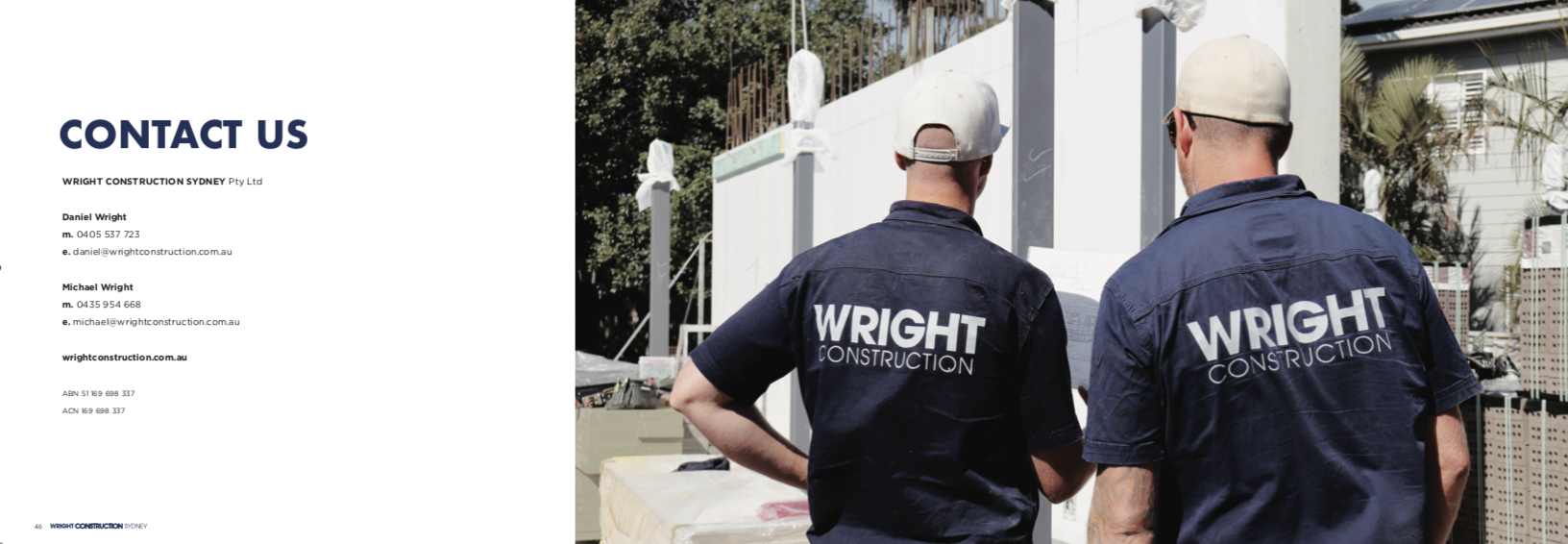
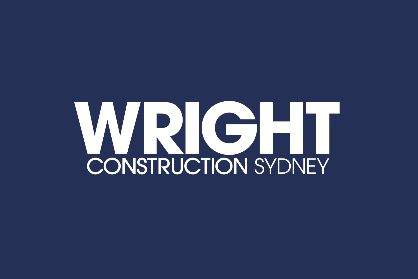
The logo needed to feel strong. Using two different font weights made the logo feel like a building, it also conveyed strength and solidarity. The logo was then placed on their website, business cards, trucks, shirts, and site banners.
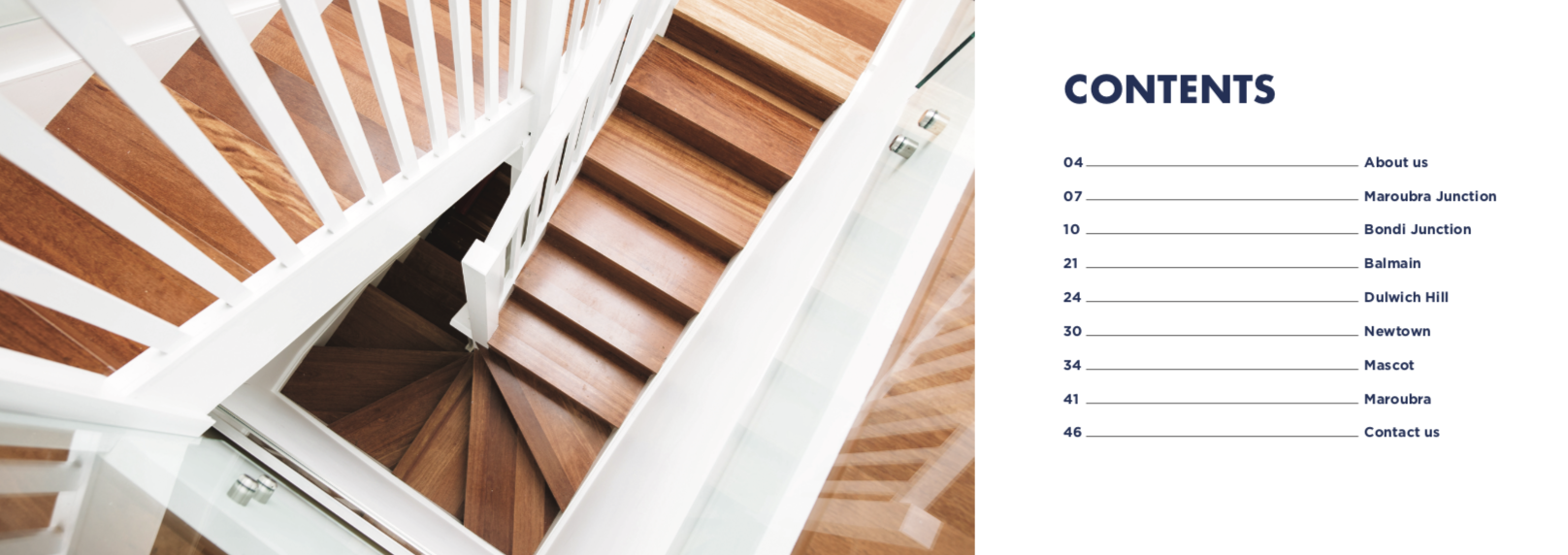
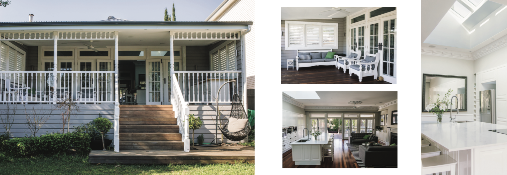
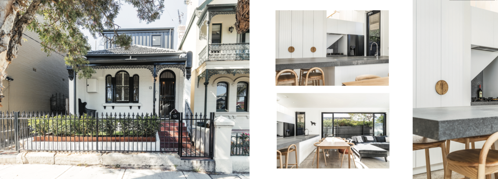
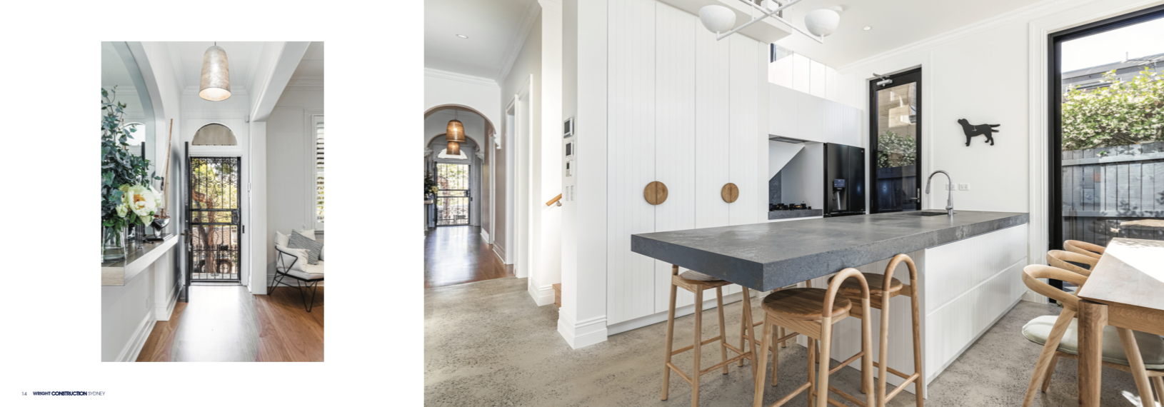
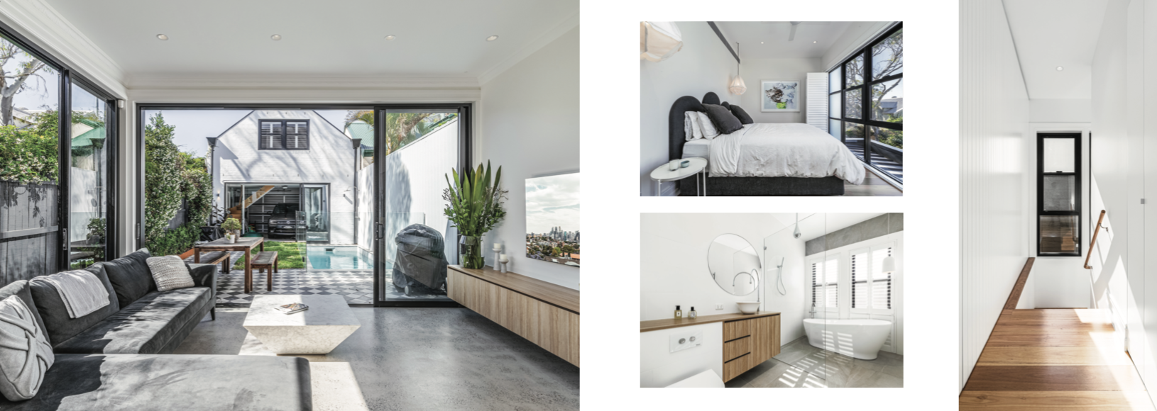
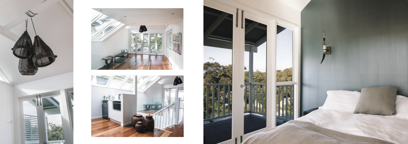
I was asked to also design a portfolio for them showing all their latest work which was printed into a 48 page booklet to give to architects and future clients.
http://wrightconstruction.com.au/


